Time Series Forecasting with Random Forest
After Josh Bloom's wonderful lecture on Random Forest regression I was excited to out his example code on my Kepler data. Josh explained regression with machine learning as taking many data points with a variety of features/atributes, and using relationships between these features to predict some other parameter. He explained that the Random Forest algorithm works by constructing many decision trees, which are used to construct the final prediction.
I wondered: could I use the Random Forest (RF) to do time series forecasting? Of course, as Jake noted, RF only predicts single properties. As a result, RF isn't a good choice for doing trend forecasting over long time periods. (well, maybe) Instead, this would use RF to just predict the next datapoint.
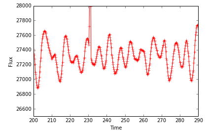
I only had a couple hours to play with the code, so the implementation was simple. I took a Quarter long chunk of long cadence light curve for the exoplanet host, Kepler 17. I smoothed the light curve, and down-sampled it to 0.2 day bins. Here is what the light curve looked like. You can see significant starspot modulations, which are nearly sinusoidal with a period of ~12 days, and evolving in amplitude.

I binned the light curve up in to 20 day windows. I moved each subsequent window by one datum. Each time window was considered one "data point", and all the flux values within the window were the "features". The flux value of the next data point after the window was the value to predict. Since the light curve was smoothly varying, the RF method did a very good job of predicting the next flux values! The experiment would be more interesting with more stochastic (read: profitable) data.
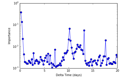
One neat output of the RF regression is an analysis of which input features were important in the final decision tree used to predict! In this next figure I show this "Importance" metric as a function of feature. Since the features were evenly spaced flux values, we can show them sorted by their lag time behind the prediction value!

What you can see is the last two data points before the prediction (first two features here) carry most of the weight. This is because the curve in Figure 1 is slowly varying with time. However, there is also "importance power" shown at times centered around 12 days: the rotation period!
Indeed, this looks somewhat like a periodogram! It is showing the times which correlate most strongly with a given data point. This isn't exactly right... and I haven't wrapped my head around it fully. You might need to re-run the entire RF prediction for the n+1 data point, and the n+2, and the n+3.... to build the actual periodogram. But nevertheless we are showing time-spectral power without assuming any shape.
This kind of analysis has a couple huge parameters that need tuning: How big should the window be? How down-sampled should the light curve be?
Also a problem at present: This implementation requires uniform (continuous) sampling, and each "data point" (window) was required to have the same number of points. I think RF can handle missing data or features, but I haven't played with it enough to know the mechanics of doing so. Could it deal with irregularly sampled data, making the times and fluxes be the features, instead of just the fluxes? I don't know... yet. Maybe I'll find out at the next Hack Week!
My sloppy, wandering code on the subject can be found here
Comments
Comments powered by Disqus